
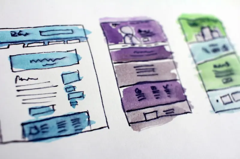
Why Micro‑Interactions Are the Secret Sauce of Modern Web Design
When I first started tinkering with HTML and CSS in a cramped college dorm, I was obsessed with big design concepts—hero images, bold typography, and sprawling layouts. Those elements still matter, but the real magic that keeps users coming back lives in the tiny, often unnoticed moments between clicks. I call them micro‑interactions, and they are the unsung heroes of contemporary web design.
In this post I’ll peel back the layers of these subtle gestures, explore the psychology that makes them so compelling, and give you a practical framework for weaving them into any digital product—without drowning your design system in endless animation specs.
The Psychology Behind Micro‑Interactions
Human beings are wired for feedback. In the physical world, we rely on sound, touch, and visual cues to understand cause and effect. A door that squeaks when it opens, a button that clicks when pressed, a light that flickers when a machine powers up—these are all tiny assurances that our actions are having an impact.
When we translate that into a web experience, micro‑interactions become the digital equivalents of those cues. They provide:
- Affirmation – Letting users know an action was registered (e.g., a checkmark after form submission).
- Guidance – Subtle nudges that help users understand next steps (e.g., a shaking input field to indicate an error).
- Delight – Unexpected, pleasant animations that create an emotional connection (e.g., a heart that beats when a user “likes” a post).
Neuroscience research shows that these micro‑rewards trigger dopamine release, reinforcing the behavior and increasing the likelihood of repeat engagement. In other words, a well‑crafted micro‑interaction can turn a mundane click into a memorable experience.
Designing Micro‑Interactions Without Overkill
It’s tempting to go full‑blown with motion, but restraint is key. Here’s my three‑step mantra for keeping micro‑interactions elegant:
- Purpose First: Ask yourself what problem the interaction solves. Is it confirming an action, preventing an error, or simply adding a touch of personality? If the answer is “just because,” reconsider.
- Consistency Matters: Your micro‑interactions should feel like part of a unified language. Establish a palette of easing curves, durations, and visual motifs that can be reused across the product.
- Performance Over Perfection: Even a 50 ms delay can feel sluggish on a mobile connection. Prioritize lightweight CSS animations or the Web Animations API over heavyweight JavaScript libraries.
By anchoring each micro‑interaction to a clear intention, you avoid the common pitfall of “animation for animation’s sake,” which can actually degrade usability.
Tools & Workflows That Make Implementation Seamless
In my day‑to‑day workflow, I blend design and development tools to keep the hand‑off frictionless:
- Figma Prototyping: Use Figma’s interactive components to prototype micro‑interactions early. The “Smart Animate” feature lets you visualize easing and timing without writing code.
- Storybook: A component library like Storybook becomes a sandbox for testing interactions in isolation, ensuring they behave consistently across browsers.
- CSS Custom Properties: Store your timing and easing values as custom properties (e.g.,
--duration-short: 120ms;) so designers can tweak them without diving into the codebase.
When you pair these tools with a design‑system‑first approach, micro‑interactions become a repeatable asset rather than an afterthought.
Measuring Impact: From Delight to Data
Design intuition is powerful, but the best decisions are data‑driven. I love leveraging Low‑Code Data Integration pipelines to capture interaction metrics in real time. By instrumenting events such as “button‑clicked” or “error‑shake‑triggered,” you can feed data into a dashboard and answer questions like:
- Do users complete a form faster after adding a success animation?
- Is the error‑shake reducing the abandonment rate on checkout pages?
- Which micro‑interactions correlate with higher NPS scores?
Couple this with Semantic SEO for Dynamic Apps to ensure that your animated components are still crawlable and indexable. Structured data can describe interaction states, helping search engines understand the richness of your UI without compromising performance.
Integrating Micro‑Interactions Into a Larger Design System
Design systems often focus on color, typography, and component layout. Micro‑interactions deserve their own sub‑section:
- Interaction Tokens: Define reusable tokens for duration, easing, and delay. Think of them as the rhythm section of your design orchestra.
- State Diagrams: Document how components transition between states (idle → hover → active → success). This visual map becomes a single source of truth for developers.
- Accessibility Checklist: Ensure that motion doesn’t hinder users with vestibular disorders. Offer a “reduce motion” toggle that respects the
prefers-reduced-motionmedia query.
When you embed these guidelines directly into your component library, teams can spin up new features without reinventing the interaction wheel each time.
Scaling the Practice Across Teams
One of the biggest challenges is getting buy‑in from product, engineering, and design squads. I recently read Google’s Hidden Playbook for Scaling SaaS Teams, which emphasizes the power of “cross‑functional guilds.” Form a micro‑interaction guild that meets bi‑weekly to share patterns, review performance data, and iterate on the interaction token set. This creates a feedback loop that keeps the practice alive as your product scales.
Future Trends: AI‑Generated Motion and Adaptive Feedback
Looking ahead, generative AI is making waves in motion design. Tools can now suggest easing curves based on user behavior, automatically tailoring the intensity of an animation to a specific user segment. Imagine an onboarding flow that subtly accelerates its feedback for power users while slowing down for newcomers—a dynamic micro‑interaction that adapts in real time.
While the technology is still nascent, the principle remains the same: micro‑interactions should serve the user’s moment‑to‑moment needs, not the designer’s ego.
Closing Thoughts
Micro‑interactions are more than decorative flourishes; they’re the connective tissue that binds users to digital experiences. By grounding each gesture in purpose, embedding it within a robust design system, and measuring its impact with data, you turn fleeting animations into strategic assets.
If you’ve ever felt that a small “ping” after saving a draft made you smile, you already understand their power. The next time you sit down to design a new feature, start with the tiniest interaction first—because sometimes, the biggest impact lives in the smallest details.

Sanji Patel is a Staff Writer at Blogging Fusion and a globally recognized SEO consultant with 25 years of industry experience. He specializes in delivering comprehensive technical and editorial SEO services to news publishers worldwide. Sanji frequently shares his insights as a speaker at international conferences and delivers annual guest lectures at local universities.
Professional Profile
- Current Role: Staff Writer at Blogging Fusion.
- Core Expertise: Technical and editorial SEO strategy.
- Target Audience: Global news publishers and digital media outlets.
- Industry Experience: 25 years of dedicated SEO consultancy.
- Public Engagement: International conference speaker and university guest lecturer.
Related Posts

Designing for Delight: How Slow Living Shapes Modern Web Experiences
Discover how embracing slow‑living mindset reshapes web design, creating calm, purposeful sites th... Read More
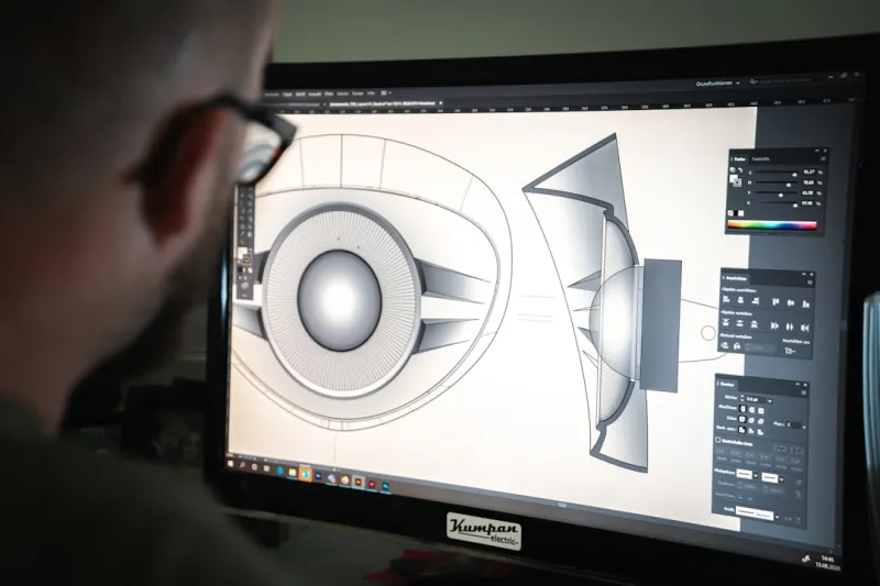
Designing for the Moment: Robert Mathews on Why Web Design Is a Act in 2024
Robert Mathews shares a perspective on 2024 web design, covering adaptive aesthetics, micro‑animat... Read More

The Psychology of Web Design: How Color, Layout, and User Experience Impact Mental Health
Learn how web design impacts mental health and what designers can do to create more supportive onlin... Read More
Top Posts

Enzyme Alchemy: Turning Kitchen Leftovers Into Powerful Eco‑Cleaners
Learn to transform everyday kitchen leftovers into potent, zero‑waste enzyme cleaners that outperform chemicals while keeping your home healthy and eco‑frie...Read More

A Fresh Take on Anniversary Rituals: Crafting Your Own Timeless Story
Explore how to create a simple, meaningful ritual for your anniversary that weaves personal stories, symbols, and quiet moments into a lasting tradition....Read More
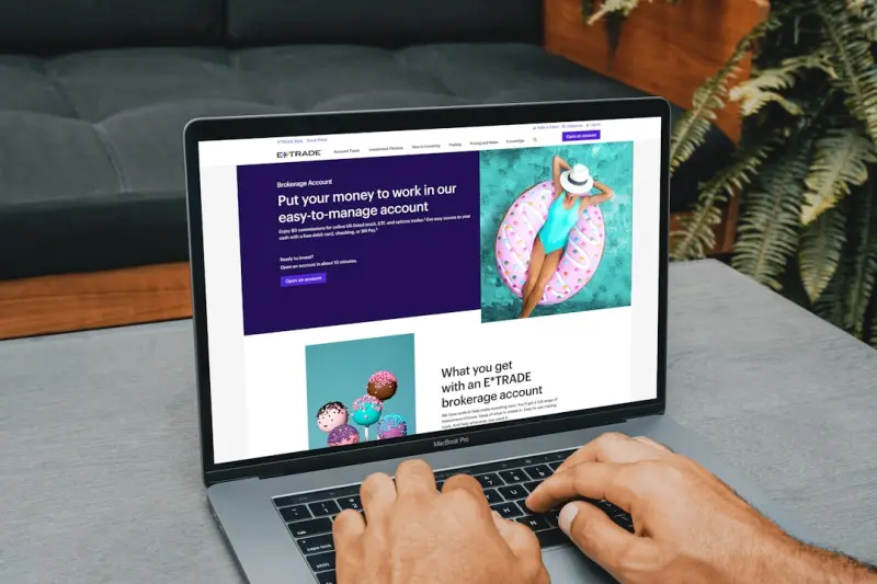
Designing On-Page SEO for Accessibility and Human‑Centric Experiences
Discover why accessibility is a vital on‑page SEO factor, with actionable steps, tools, and case studies that show how inclusive design can drive higher ranki...Read More

The Ultimate Guide to Keeping Kids Safe in a Digital World
A comprehensive, parent‑focused guide that blends home safety, digital protection, community support, and emergency preparedness to keep kids safe while foste...Read More
0 Comments
Post Comment
You will need to Login or Register to comment on this post!