

Why Slow Living Is the New Compass for Web Designers
In a world where click‑through rates are measured in milliseconds, I find myself constantly questioning the frantic sprint for novelty. My design philosophy has shifted from chasing the latest trend to cultivating an environment where intentionality and user wellbeing become the cornerstone of every pixel placed. By embracing the slow‑living mindset, I allow the design process to breathe, giving space for deeper research, thoughtful iteration, and the kind of empathy that turns a functional site into a memorable experience. This approach isn’t about abandoning speed; it’s about redefining speed as purposeful, measured, and aligned with long‑term brand health.
The Core Tenets of Slow‑Living Web Design
At its heart, slow‑living web design is a commitment to clarity, consistency, and calm. I start every project by mapping out the user journey in broad strokes, resisting the urge to overload the canvas with unnecessary animations or flashy micro‑interactions that distract rather than delight. The goal is to create a rhythm that mirrors natural human behavior—pages that load just fast enough to keep attention, yet not so fast that they feel rushed or shallow. By grounding design decisions in the principle of “less is more,” we build trust, reduce cognitive overload, and invite users to linger, explore, and return.
Designing for Delight: The Human‑Centric Lens
When I read Designing for Delight, I was reminded that delight isn’t a by‑product of chaos; it’s a carefully engineered outcome of simplicity and relevance. I embed moments of surprise—like subtle color shifts or gentle hover states—only when they serve a functional purpose, such as reinforcing a call‑to‑action or guiding the eye. These micro‑delights act like punctuation in a well‑written paragraph, offering readers brief pauses that enhance comprehension without breaking flow. The result is a site that feels alive yet unhurried, inviting users to engage on their own terms.
Performance Without Compromise
One of the biggest misconceptions about slow‑living design is that it sacrifices performance. In reality, the opposite is true: by stripping away excess code, heavy scripts, and oversized assets, we dramatically improve load times and reduce bounce rates. I lean on modern techniques like lazy loading, SVG icons, and CSS‑only animations to keep the bundle size lean while preserving visual richness. This disciplined approach not only pleases users but also aligns with search engine preferences, where speed and relevance are increasingly intertwined with ranking signals.
Sustainable Hosting as a Design Decision
Choosing a hosting provider is more than a technical checkbox; it’s an extension of the design philosophy. A sustainable host that emphasizes energy efficiency and responsible resource allocation mirrors the slow‑living ethos of mindfulness and long‑term stewardship. While I won’t name a specific provider here, the principle remains clear: prioritize platforms that balance performance with ecological impact, ensuring the digital footprint of your site aligns with the broader values you champion through design.
Choosing Tools Wisely for a Balanced Workflow
My toolbox has evolved to reflect the same intentionality I apply to visual design. I favor lightweight editors, modular component libraries, and version control practices that encourage incremental change rather than wholesale overhauls. The article Choosing Tools Wisely perfectly captures this mindset, emphasizing that the right tools amplify productivity without demanding a sacrifice in quality. By integrating design systems that promote reuse and consistency, we eliminate redundant work and free mental bandwidth for creative problem‑solving.
The Role of Typography and White Space
Typography, when treated as a living organism rather than a decorative afterthought, becomes a conduit for calm. I select typefaces that offer generous x‑heights and clear hierarchy, pairing them with ample white space to give content room to breathe. This combination reduces visual noise and guides the reader’s eye naturally from headline to body copy, reinforcing the narrative flow. In practice, I often use a maximum line length of 70 characters and line heights that promote legibility, ensuring the user’s experience feels effortless and inviting.
Integrating Storytelling Into the UI
Every page should tell a story that resonates with the audience’s aspirations and challenges. By weaving narrative arcs into the UI—through progressive disclosure, contextual hints, and relatable imagery—we transform static layouts into interactive journeys. This storytelling approach aligns with slow‑living values, as it encourages users to move at their own pace, absorbing information in digestible fragments rather than being bombarded with a wall of content. The result is a deeper emotional connection that can translate into higher conversion rates and brand loyalty.
Future‑Proofing Your Design with Slow‑Living Principles
Looking ahead, the most resilient websites will be those built on the foundation of intentional design, sustainable practices, and adaptive technology. By embedding slow‑living principles now—prioritizing clarity, performance, and user wellbeing—we future‑proof our work against the inevitable shifts in algorithms, device capabilities, and consumer expectations. This isn’t a fleeting trend; it’s a strategic stance that positions designers as guardians of digital well‑being, ensuring the web remains a place of thoughtful interaction rather than relentless noise.

Jimmy Anand is a content creator that gets inspired by many aspects of life, internet or whatever inspires him at that moment. When he's not online he's gaming and when he is not gaming he is online trolling discussion boards.
Related Posts

Design Systems as Living Organisms: Adaptive Micro‑Interactions for the Next‑Gen Web
A deep dive into turning design systems into living organisms, using adaptive micro‑interactions t... Read More
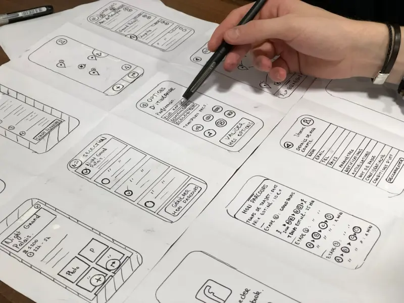
Designing for Cognitive Flow: How Web Interfaces Can Boost Human Focus
A deep dive into designing web experiences that nurture cognitive flow through contextual clarity, r... Read More

Designing Author Websites for SEO Success: A Practical Guide
In the modern literary landscape, an author website is far more than a digital brochure; it is the c... Read More
Top Posts

Navigating the Legal Frontier: How Technology, Data, and Sustainability Are Reshaping Law
A deep dive into the evolving legal landscape, where AI, data rights, and sustainable practices intersect, challenging lawyers to adapt and lead....Read More

AI‑Powered Plugins Are Rewriting SaaS Workflows
AI‑powered plugins are turning static SaaS platforms into adaptive ecosystems. Learn the cultural shift, security checklist, monetization models, and success ...Read More

10 Green Tips to Eco-Proof Your Home
As concerns over climate change and environmental sustainability grow, many homeowners are looking for ways to reduce their ecological footprint. Fortunately, m...Read More

The Intersection of Technology and Sustainable Living: A New Era of Digital Tools
The intersection of technology and sustainable living is complex and multifaceted. Discover how digital tools are promoting sustainable living and creating a mo...Read More
0 Comments
Post Comment
You will need to Login or Register to comment on this post!