
Designing for Cognitive Flow: How Web Interfaces Can Boost Human Focus
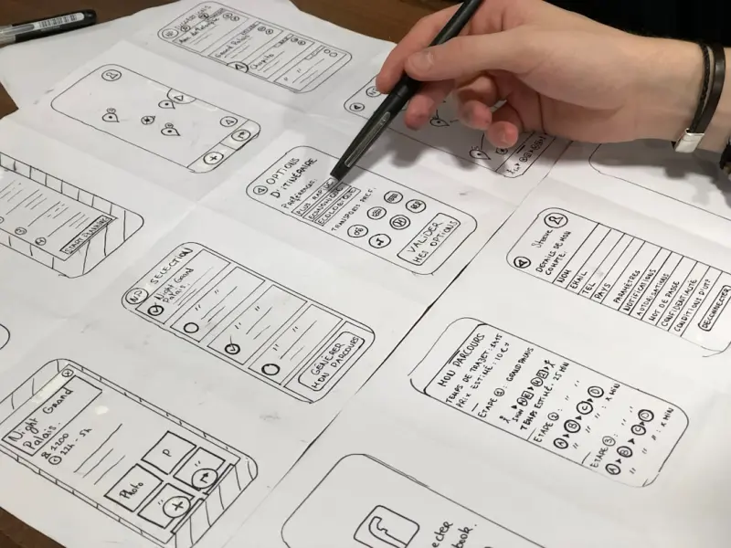
When I first started sketching wireframes, I was obsessed with pixels, color palettes, and the latest UI trends. Over the years, my perspective shifted from “how does it look?” to “how does it feel – in the brain?” Today, the most valuable competitive edge for a web product isn’t a flashier animation or a richer icon set; it’s the ability to align the digital experience with the natural rhythms of human attention.
In an age where users juggle dozens of tabs, notifications, and endless streams of content, the web’s default state feels chaotic. This chaos isn’t just a design problem—it’s a cognitive one. The human brain is wired for flow, a state of deep focus where distractions fade and productivity soars. Yet, most sites unintentionally sabotage that flow by overloading visual stimulus, demanding unnecessary navigation steps, and ignoring the subtle cues that guide our mental models.
In this post, I’ll share a framework for building web experiences that nurture cognitive flow. We’ll explore three core pillars: contextual clarity, micro‑interaction rhythm, and energy‑aware performance. Along the way, I’ll sprinkle in a few real‑world tactics you can start applying tomorrow, and I’ll reference some deeper technical reads that informed my thinking.
1. Contextual Clarity: Reduce the Decision‑Making Load
Every time a visitor lands on a page, they ask a silent question: What should I do next? The faster you can answer that question, the less cognitive bandwidth the user spends on indecision, and the more they can devote to the task at hand.
- Visual Hierarchy as a Decision Map. Use size, contrast, and spacing deliberately to indicate priority. A primary call‑to‑action (CTA) should dominate the visual field, while secondary actions recede. This mimics the way our brain processes salient stimuli in the real world.
- Progressive Disclosure. Show only what’s needed for the current step. Hidden sections, accordions, or lazy‑loaded content keep the interface tidy, preventing the user from feeling overwhelmed.
- Consistent Terminology. Avoid mixing “sign‑up,” “register,” and “join” across the same flow. Consistency reduces the mental translation effort.
One technique I love is the “single‑question page.” Instead of a dense form, break the process into a series of pages, each asking just one question. This not only simplifies the visual layout but also aligns with the brain’s preference for discrete, manageable chunks of information.
2. Micro‑Interaction Rhythm: Harness the Power of Subtle Motion
Micro‑interactions—those tiny animations that occur when you hover over a button, toggle a switch, or receive a notification—are more than decorative flourishes. They act as feedback loops, confirming that the system has registered the user’s intent. When timed correctly, they become a rhythmic guide that keeps the user in sync with the interface.
Here are three rhythm‑focused micro‑interaction strategies:
- Predictable Duration. Aim for 100–300 ms for most feedback animations. Anything longer feels sluggish; anything shorter can be missed. Consistency in timing builds an internal metronome for the user.
- Purposeful Easing. Use easing curves that convey the nature of the action. A gentle ease‑out for a successful submission feels rewarding, while a sharp bounce can signal an error that needs attention.
- Subtle Auditory Cues. When appropriate, a soft click or chime can reinforce the visual feedback, especially for accessibility‑focused users who rely on multimodal cues.
Crucially, avoid “animation bloat.” Over‑animating every element can drown the essential signals in a sea of motion, increasing cognitive load rather than decreasing it.
3. Energy‑Aware Performance: Design for Sustainable Attention
Performance has always been a cornerstone of good web design, but its impact on user focus is often understated. A page that loads in 3 seconds may be “fast enough” by traditional metrics, yet the intermittent pauses can fragment attention, causing the brain to reset its focus state.
To keep the user in a continuous flow, aim for sub‑second perceived load times for key interactions. Here are actionable steps:
- Critical‑Path Prioritization. Load above‑the‑fold content first, defer non‑essential scripts, and leverage HTTP/2 multiplexing to reduce round‑trip latency.
- Asset Optimization. Compress images to WebP, serve SVG icons, and use modern font formats (WOFF2). Every kilobyte saved translates to a smoother experience.
- Smart Caching. Employ service workers to cache static assets and pre‑fetch data for anticipated user actions, eliminating visible delays.
For those interested in the deeper technical underpinnings of performance, I recommend checking out the dedicated backend article, which dives into how intelligent hosting layers can shave milliseconds off every request.
4. The Human‑First Information Architecture
Beyond visual design, the structural layout of content determines how effortlessly a user can locate information. An information architecture that mirrors the user's mental model reduces “cognitive friction.”
Steps to achieve a human‑first IA:
- Conduct Card‑Sorting Sessions. Let real users group content. Their natural categorization often reveals hidden hierarchies you may have missed.
- Map User Journeys. Identify primary goals (e.g., “find pricing,” “download a guide”) and ensure each journey has a clear, linear path with minimal back‑tracking.
- Leverage Breadcrumbs. Breadcrumb trails give users a sense of place within the site, reinforcing spatial memory and reducing the need for mental mapping.
When you align site structure with how users think, you eliminate the “lost in the maze” feeling that often triggers drop‑offs.
5. Accessibility as a Flow Enabler
Accessibility isn’t just a compliance checkbox; it’s a catalyst for flow. By designing for the widest range of abilities, you inherently simplify interactions for all users.
- Keyboard‑Friendly Navigation. Ensure every interactive element is reachable via Tab and clearly indicated with focus outlines.
- Readable Typography. Use sufficient line‑height and contrast ratios (WCAG AA minimum of 4.5:1) to reduce eye strain.
- Descriptive ARIA Labels. Provide meaningful labels for screen readers, so users don’t need to guess the purpose of a button.
When a user can navigate effortlessly—whether via mouse, keyboard, or assistive technology—they stay in the zone longer, boosting conversion potential.
6. Data‑Driven Refinement: The Feedback Loop
Designing for flow isn’t a one‑off exercise; it’s an ongoing cycle of observation, hypothesis, and iteration. Here’s a simple framework:
- Measure Attention Metrics. Use tools that capture scroll depth, time‑on‑page, and interaction latency. Heatmaps can reveal where users hesitate.
- Identify Friction Points. Look for spikes in drop‑off or unusually long dwell times on non‑critical elements.
- Test Micro‑Changes. A/B test variations of button size, animation duration, or content ordering. Even a 0.1 s change in perceived speed can shift user sentiment.
- Iterate Continuously. Feed the results back into the design system, creating a living repository of flow‑optimized patterns.
If you’re curious about how modular extensions can amplify this iterative process, the piece on modular extension strategy offers a deep dive into building flexible architectures that support rapid UI experiments.
7. The Future: Generative Design for Adaptive Flow
Looking ahead, generative AI is poised to become a co‑designer, tailoring layouts on the fly based on real‑time user behavior. Imagine a system that detects a user’s reading speed, adjusts line length, and reorders content blocks to keep them engaged without conscious effort.
While we’re still early in that journey, the foundation we lay today—clear hierarchy, purposeful micro‑interactions, and razor‑sharp performance—will be the scaffolding upon which adaptive experiences are built.
Putting It All Together
Designing for cognitive flow isn’t about adding more bells and whistles; it’s about stripping away the noise that steals attention. By focusing on contextual clarity, rhythmic micro‑interactions, energy‑aware performance, human‑first architecture, and inclusive accessibility, you create a web environment where users can slip into a state of deep focus.
Start small: pick one page, audit its visual hierarchy, tighten its load time, and observe the difference. Then expand the methodology across your product. The payoff isn’t just higher conversion rates—it’s a reputation for delivering experiences that truly respect the user’s mental bandwidth.
When your design aligns with the brain’s natural flow, you’re not just building a website; you’re crafting a seamless extension of human cognition.

David Moore is a freelance writer specializing in two dynamic and ever-evolving fields: gambling and the tech industry. With a keen eye for detail and a knack for unraveling complex topics, David delivers insightful and engaging content that keeps readers informed and entertained.
Related Posts

Micro‑Interactions: The Quiet Engine Behind Engaging Web Experiences
Micro‑interactions, the tiny animated cues that follow user actions, are reshaping web design by g... Read More

The Future of Web Design: Trends to Watch
The future of web design is all about creating immersive, interactive experiences that engage and de... Read More

Designing for the Human Brain: Neuro‑Friendly Web Experiences
Discover a brain‑centric approach to web design that reduces cognitive load, improves accessibilit... Read More
Top Posts

The Charms of Aspiration: Decoding the Bag Charm Phenomenon Among Kids and Teens
In the dynamic landscape of youth culture, where trends emerge and evolve with unprecedented speed, a distinct accessory has captured the imagination and wallet...Read More

From Playroom to Boardroom: How Modern Toys Are Transforming Business Culture
Modern toys—ranging from smart building blocks to AI‑driven storytelling games—are reshaping corporate culture by enhancing creativity, collaboration, and...Read More

The Evolving Landscape of Insurance: Staying Protected in a Changing World
In a world of constant change, understanding insurance is more vital than ever. This post explores how traditional policies are adapting and new coverages emerg...Read More

When Skill Meets Luck: The New Era of Interactive Gambling
Skill‑based gaming is transforming the gambling landscape, offering players strategic depth, social competition, and modern tech integration while preserving ...Read More
0 Comments
Post Comment
You will need to Login or Register to comment on this post!