
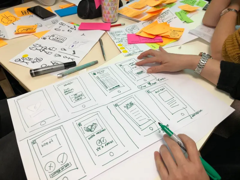
When I first started sketching wireframes on the back of napkins, I never imagined that web design would become a living, breathing ecosystem that evolves with every click, swipe, and scroll. Today, design isn’t just about making something look pretty; it’s about engineering experiences that adapt, learn, and anticipate the needs of users while staying true to brand intent. In this deep dive, I’ll share how to build a design framework that feels organic, resilient, and future‑proof—without getting lost in the hype of every new tool that flashes across our feeds.
Design as a Continuous Conversation
Think of a website as a dialogue rather than a static billboard. Every element—from typography to micro‑animation—should be a response to user intent, not a one‑off declaration. To nurture that conversation, I start by mapping out user moments instead of pages. A “moment” captures the emotional state and goal of a visitor at a specific touchpoint, allowing designers to craft nuanced interactions that feel personal.
For example, a first‑time visitor may need reassurance; a returning customer seeks speed. By aligning visual cues, copy tone, and interaction speed to these moments, you create a rhythm that users unconsciously follow, turning a site into a trusted companion rather than a digital billboard.
Living Design Systems: The Backbone of Agility
Design systems have been championed as the answer to scaling consistency, but many teams treat them as a static repository of components. I argue for a living design system—one that evolves with data, feedback, and emerging trends. This means establishing a clear governance model that includes:
- Versioned component libraries that track changes and deprecations.
- Feedback loops from analytics, user testing, and support tickets feeding directly into design updates.
- Cross‑functional ownership where developers, writers, and product managers all have a say in component evolution.
When a design system becomes a shared, dynamic resource, teams can iterate faster without sacrificing cohesion. The system starts to behave like a well‑tuned orchestra, where each instrument knows its part yet can improvise when the conductor signals a change.
Micro‑Interactions: The Unsung Heroes of Delight
We all love a satisfying “like” animation or a subtle hover effect that acknowledges our presence. Micro‑interactions are the tiny gestures that give a site personality and signal responsiveness. Yet, they’re often treated as afterthoughts. To embed them strategically, ask yourself three questions for each interaction:
- What is the user’s intention at this point?
- What feedback does the user need to confirm that the action succeeded?
- How can the interaction reinforce brand tone?
Consider a checkout button that gently expands and changes color when all required fields are filled. This simple visual cue reassures the user that they’re on the right track, reducing friction and abandonment.
Performance‑First Aesthetics
Beautiful designs lose their sparkle if they lag. While speed isn’t a new conversation, the nuance lies in balancing visual richness with performance. One practical approach is to adopt progressive enhancement: start with a lean, functional core, then layer on enhancements for capable browsers. This ensures every visitor—regardless of device or connection—receives a functional experience.
Pairing this mindset with robust hosting can be a game‑changer. For instance, leveraging managed solutions that auto‑scale and cache assets intelligently can keep your design fluid without sacrificing detail. Learn more about how the right hosting foundation can empower design agility in Beyond Speed: How Managed WordPress Hosting Powers Agile Digital Teams.
Data‑Driven Aesthetics: When Numbers Meet Creativity
Design decisions have traditionally been driven by intuition, but the wealth of user data at our fingertips invites a more empirical approach. By analyzing heatmaps, scroll depth, and click paths, you can uncover which visual hierarchies actually guide users and which distract them.
Integrating this data doesn’t mean turning every design choice into a spreadsheet. Instead, use insights to validate hypotheses. For example, if analytics show a drop‑off at a form’s third field, experiment with visual cues or reorganizing the layout to maintain momentum. The synergy between data and design can be amplified with intelligent tools that surface actionable insights—read about one such approach in AI‑Enabled Decision Intelligence: Turning Data Into Actionable Revenue Levers.
Inclusive Design: Beyond Accessibility Checklists
Inclusivity is more than meeting WCAG compliance; it’s about designing for the full spectrum of human experience. This starts with empathy mapping—understanding the varied contexts in which users interact with your site, from bright office lighting to noisy public transport.
Practical steps include:
- Providing multiple ways to consume content (text, audio, visual).
- Designing flexible navigation that works with keyboard, screen readers, and voice assistants.
- Testing with diverse user groups early in the design cycle.
When inclusivity is woven into the design DNA, you not only broaden your audience but also foster brand loyalty among users who feel seen and respected.
Design Documentation: The Narrative Behind the Pixels
Every design decision has a story—why a certain color was chosen, what problem a component solves, or how a layout supports a business goal. Documenting this narrative is crucial for onboarding new team members and preserving institutional knowledge.
Use a lightweight, shareable format like a living markdown file or a collaborative design handbook. Include sections for:
- Design rationale and trade‑offs.
- User research findings that informed the design.
- Technical constraints and implementation notes.
When future teams revisit a component, they’ll understand the “why” behind its existence, preventing unnecessary re‑work and encouraging thoughtful iteration.
Future‑Proofing: Designing for Emerging Interactions
While today’s web is dominated by mouse and touch, the horizon is expanding—voice, AR, and even brain‑computer interfaces are on the rise. Preparing for these modalities doesn’t require building them now, but rather adopting principles that translate across interaction models.
Key principles include:
- Modular visual language: Use scalable vector assets that can adapt to 2D, 3D, or mixed reality.
- Context‑aware cues: Design prompts that can shift from visual to auditory based on the user's environment.
- Semantic markup: Structure content with meaningful HTML5 elements so emerging platforms can interpret and repurpose it.
By embedding these forward‑thinking practices, your design stays relevant as the web evolves.
Closing the Loop: From Launch to Evolution
Launching a website is not the finish line; it’s the start of an iterative journey. Establish a cadence for post‑launch reviews—monthly or quarterly—where you revisit analytics, gather user feedback, and assess component performance. Use these insights to refine your design system, update micro‑interactions, and polish visual storytelling.
Remember, a resilient web design strategy is a blend of empathy, data, performance, and foresight. When you treat each page as a living conversation, your site will not only look stunning but also feel intuitive, inclusive, and adaptable for years to come.

In the world of freelance writing, where creativity and adaptability are paramount, Michelle Fisher stands out as a dedicated and versatile professional. With a passion for crafting compelling narratives and a keen eye for detail, Michelle has established herself as a trusted voice.
Related Posts
Why Micro‑Interactions Are the Secret Sauce of Modern Web Design
Micro‑interactions are the tiny, purposeful animations that turn ordinary clicks into memorable ex... Read More

The Intersection of Web Design and Sustainable Living: A New Era of Eco-Friendly Innovation
The web design industry has a significant carbon footprint, but by making a few simple changes to ou... Read More
Designing for Delight: How Slow Living Shapes Modern Web Experiences
Discover how embracing slow‑living mindset reshapes web design, creating calm, purposeful sites th... Read More
Top Posts

The Curated Plugin Marketplace: Turning Extensions into Growth Multipliers
A curated plugin marketplace raises the bar for quality, security, and revenue, turning third‑party extensions into powerful growth engines for SaaS platforms...Read More
Beyond Campaigns: How Media Agencies Are Reinventing Real‑Time Storytelling
Media agencies are abandoning long‑run campaigns for rapid, data‑powered storytelling. Learn how real‑time narratives, decentralized pods, and ethical saf...Read More

Hearts: How Modern Couples Can Thrive in a Digital, Distracted World
Discover how to turn love into a digital distractions, using intentional habits, pet companionship, and creative design to keep relationships thriving....Read More
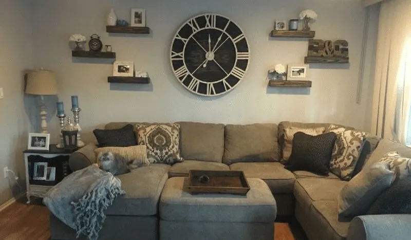
Ideas for Wall Clocks: Timeless Aesthetic to Your Home Decor
In the intricate tapestry of home decor, certain elements transcend mere utility to become pivotal statements of style and personality. Among these, the unassum...Read More
0 Comments
Post Comment
You will need to Login or Register to comment on this post!