
Designing for Neurodiversity: Building Web Experiences That Speak to Every Brain
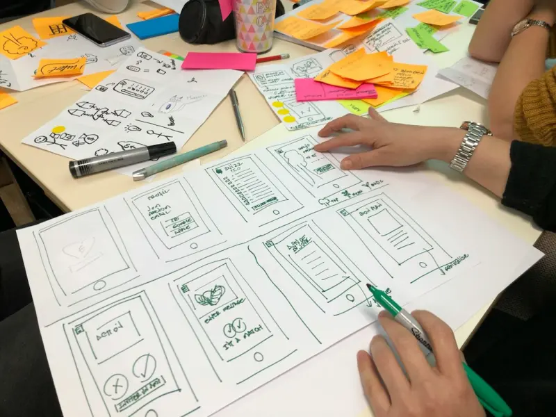
When I first started sketching sites on a whiteboard, I thought the biggest challenge was making things look cool. Over the years, the conversation shifted. Today, the most rewarding part of my job is ensuring that a design works for everyone—not just the average user, but for the full spectrum of neurodivergent minds that navigate the web every day.
Neurodiversity embraces conditions such as autism, ADHD, dyslexia, and many other cognitive profiles. These users don’t just need a site that “looks good”; they need an experience that feels intuitive, reduces friction, and respects the way their brains process information. In this article, I’ll walk you through a practical framework that blends research, empathy, and a dash of design bravado to create digital spaces that truly belong to everyone.
Why Neurodiversity Matters in Web Design
Businesses often equate “user experience” with conversion metrics. That’s a narrow view. A neurodivergent user who can’t locate a checkout button or who feels overwhelmed by a flashing carousel will abandon the journey long before the funnel metrics even register.
- Market Reach: Roughly 15‑20% of the global population identifies as neurodivergent. Ignoring this segment is a missed revenue opportunity.
- Brand Trust: Companies that champion inclusive design are perceived as more trustworthy and socially responsible.
- Legal Landscape: Accessibility laws (like the ADA in the United States) are expanding to cover cognitive accessibility, not just visual or auditory impairments.
When you design with neurodiversity in mind, you’re not just ticking a compliance box—you’re future‑proofing your product for a broader, more engaged audience.
The Five Pillars of Neuro‑Inclusive Web Design
Think of these pillars as a checklist you can embed into any design sprint. Each pillar addresses a specific cognitive need, and together they create a harmonious experience.
1. Predictable Navigation
Neurodivergent users often rely on consistency to reduce cognitive load. A predictable navigation hierarchy—clear headings, consistent placement of menus, and logical grouping of related pages—acts like a mental map that reduces anxiety.
- Use semantic HTML for navigation elements so screen readers and assistive technologies can interpret the structure correctly.
- Limit the number of top‑level menu items to seven or fewer; the brain can comfortably hold 7 ± 2 items in working memory.
- Provide a breadcrumb trail on deeper pages to show users where they are in the site’s architecture.
2. Visual Clarity & Hierarchy
People with dyslexia or low vision benefit from high‑contrast text, generous line spacing, and a clear visual hierarchy. This doesn’t mean you have to sacrifice style—just be intentional.
- Choose fonts that are easy on the eyes (e.g., sans‑serif, open‑type). Avoid decorative typefaces for body copy.
- Apply CSS variables for color schemes, making it easy to toggle between a “high‑contrast mode” and a “soft‑focus mode.”
- Use white space liberally; it acts as a visual pause button for the brain.
3. Interaction Simplicity
Micro‑interactions—like hover states, loading spinners, and button animations—can be both delightful and disorienting. For neurodivergent users, simplicity is key.
- Prefer subtle, non‑blinking animations. Avoid rapid flashing or auto‑moving elements that can trigger sensory overload.
- Provide keyboard shortcuts for common actions (e.g., “Ctrl + S” to save a form).
- Allow users to pause or disable any auto‑play media or carousel.
4. Clear Language & Content Chunking
Plain language is a superpower. Break content into bite‑size chunks, use bullet points, and write with a conversational tone.
- Define jargon in a tooltip or glossaries; don’t assume the user knows industry‑specific acronyms.
- Use progressive disclosure—show only the essential information upfront, and reveal details on demand.
- Incorporate visual cues (icons, illustrations) alongside text to reinforce meaning.
5. Adaptive Personalization
One size truly does not fit all. Leveraging AI responsibly can help tailor the experience to an individual’s preferences without being intrusive.
For example, a site could remember that a user prefers a “dark mode” and a simplified navigation layout, then automatically present those settings on subsequent visits. This is where design meets technology—balancing personalization with privacy.
Speaking of AI, the conversation around safety and ethical use is heating up. Companies that embed AI safety guardrails into their personalization engines are not only protecting user data but also building trust.
Implementing Neuro‑Inclusive Design: A Step‑by‑Step Playbook
Below is a practical workflow you can integrate into a typical agile sprint. Feel free to adapt the timeline to fit your team’s cadence.
- Empathy Research: Conduct interviews with neurodivergent participants. Use surveys that ask about pain points like “I get lost in menus” or “I’m overwhelmed by animations.”
- Persona Expansion: Augment your existing personas with neurodiversity attributes (e.g., “Alex, 28, autistic, prefers minimal UI”).
- Design Ideation: Sketch low‑fidelity wireframes that emphasize the five pillars. Keep the color palette limited and test contrast ratios with tools like WCAG 2.2.
- Prototype & Test: Build interactive prototypes using tools that support screen reader simulation and keyboard navigation testing. Conduct usability sessions with participants who match your expanded personas.
- Iterate: Capture feedback, adjust micro‑interactions, and refine content hierarchy.
- Launch with Feature Flags: Deploy neuro‑inclusive features behind toggles so you can A/B test performance and adoption without impacting the entire user base.
- Monitor & Optimize: Use analytics to track metrics such as time‑to‑task completion and error rates for users who enable neuro‑inclusive settings.
Performance as a Sustainability Issue
While we’re championing inclusivity, we can’t ignore performance. A slow site is a barrier for everyone, especially those with attention‑deficit challenges. Optimizing load times reduces cognitive strain and aligns with sustainable web practices.
One approach is to rethink cloud hosting and leverage edge computing. By serving assets from geographically closer nodes, you shave milliseconds off the response time—seconds that add up in a user’s perception of speed.
Measuring Success: Beyond Conventional Metrics
Traditional KPIs like bounce rate or session duration only tell part of the story. To truly gauge neuro‑inclusive impact, consider these additional metrics:
- Task Success Rate: Percentage of users who complete a goal without assistance.
- Error Frequency: Number of form validation errors per session.
- Assistive Feature Adoption: How often users enable “high‑contrast mode,” “simplified navigation,” or other accessibility toggles.
- Qualitative Feedback: Open‑ended comments about cognitive comfort and mental workload.
Combine quantitative data with qualitative insights to build a holistic picture of how well your site serves neurodivergent users.
Future Trends: The Rise of Cognitive‑First Design Systems
Design systems are evolving from visual component libraries to holistic experience kits that embed cognitive considerations at the core. Imagine a component library where each button, modal, and form field comes with built‑in accessibility settings, performance budgets, and AI‑driven personalization options.
In the next wave, we’ll likely see platforms that automatically recommend layout adjustments based on real‑time user behavior—essentially a design co‑pilot that helps you stay aligned with neuro‑inclusive best practices without manual overhead.
Conclusion: Design as a Human‑Centric Superpower
Designing for neurodiversity isn’t a gimmick; it’s a strategic imperative that unlocks new markets, deepens brand loyalty, and creates a more humane internet. By embracing predictable navigation, visual clarity, simple interactions, clear language, and adaptive personalization, you set the stage for a web that welcomes every brain.
Remember, the journey doesn’t end at launch. Continuous testing, data‑driven iteration, and an unwavering commitment to empathy will keep your site ahead of the curve—both ethically and commercially.
If you’re ready to take the next step, start with a simple audit of your current site against the five pillars. You’ll be surprised how many low‑hanging fruit you can fix today.
Let’s build a web that feels like home for everyone, regardless of how they think, process, or perceive.

Shawn DesRochers is a certified Microsoft technician and Programmer with 30+ year's experience. He has written many reviews on computer related products, software, and SEO related topics. When he's not writing reviews he can be found at one of the Oldest Directories Online Blogging Fusion Business Directory which he is the CEO of.
Related Posts
When Web Design Meets Sustainable Attention: A New Paradigm
Designers are shifting focus from endless clicks to sustainable attention, using minimalist navigati... Read More

Designing for the Human Brain: Neuro‑Friendly Web Experiences
Discover a brain‑centric approach to web design that reduces cognitive load, improves accessibilit... Read More
Designing Living Web Experiences: A Framework for Adaptive, User‑Centric Sites
Discover how to build web experiences that evolve with users, using living design systems, micro‑i... Read More
Top Posts

Gamified Loyalty: The Hidden Engine Driving Online Casino Retention
Discover how gamified loyalty systems turn everyday casino play into a rewarding adventure, boosting player retention while balancing excitement with responsibl...Read More

Peer‑to‑Peer Learning Platforms: The New Engine Driving Modern Education
Peer‑to‑peer learning platforms turn every learner into a teacher, creating a dynamic, data‑rich ecosystem that accelerates skill acquisition and fosters ...Read More

The Future of Web Design: Trends to Watch
The future of web design is all about creating immersive, interactive experiences that engage and delight users. Learn about the latest trends and technologies ...Read More

Networking in 2024: Miranda Murphy’s Playbook for Real‑World Connections
Miranda Murphy shares her 2024 networking playbook, mixing genuine face‑to‑face interactions, AI‑enhanced outreach, and tech‑savvy strategies to turn ev...Read More
0 Comments
Post Comment
You will need to Login or Register to comment on this post!